
So I’m thinking about moving to Rhode Island and wanted to be able to have some sort of idea how the markets are up there. When is the best time to buy? How is the market growing? Or is it shrinking? How quickly do I need to make a move?
To answer these questions I turned to Python.
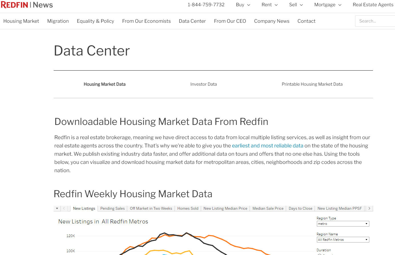
A little research, and I really do mean “little”, brought me to Redfin. Redfin has publicly accessible data covering varying topics all across the United States housing market.
The best part is that I can load this data directly into Python without having to download a CSV or Zip File.
url = 'https://redfin-public-data.s3.us-west-2.amazonaws.com/redfin_market_tracker/county_market_tracker.tsv000.gz'

National_Data = pd.read_csv(url,compression = 'gzip', sep ='\t', on_bad_lines = 'skip')
That dataset contains market data for counties all across the US since 2012. Given I only care about Rhode Island and any data prior to Covid would be useless, I narrowed the data down to everything after 2021 in the following Rhode Island counties:
Bristol County
Kent County
Newport County
Providence County
From here I have quite a few pieces of data to look at since Redfin tracks 30+ categories per monthly entry. Some categories include Number of New Listings, Pending Listings, Sold, Percent of the market whose price dropped, Number of homes sold above listing, Number of listings off the market within two weeks, Median list price, median sold price, the monthly and yearly averages for those numbers and so on.
So what do I care about? Great question. I’m not quite sure that I know what I’m looking for but I know what interests me and what might give me some ideas. So I created a series of graphs.
New Listings vs. Pending vs. Sold vs. Sold Above List
What does this graph tell me? Well it gives me an idea of how fast the market is moving and its relative demand. If New listings outpace Pending and/or Sold, then it’s a buyers market. Alternatively, if New can;t keep up with Peding/Sold, it’s a sellers market. And if Sold Above List price goes up, then demand is even higher.

Median Sale v Median List Price
Here I can figure out if the Median List Price has some wiggle to it. If the Median Sale price is higher than the list price, there may be more demand in the area. Or the listed price is just a conversation starter. However, if the Median Sale price is lower than the List price, that means the market may be softening and the buyer has more negotiating power. Which would be good to know for the county you are buying in.

Sold Above List v. Price Dropped v. Off Market in Two Weeks
This graph is similar to the first graph in that it tells me the markets strength at current pricing. Are the homes selling for more or less than originally listed for? And how quickly are they moving off the market? Is it above listing and off the market in two weeks? Or is the price dropping and staying on the market?

Finally, in order to make this report useful to me, I automated it to pull at the beginning of each month and to email me personally when it does. I get a curated email for each county giving me insight into how that market is performing and how I might want to enter it.